
Introduction
ReactJS is the latest JavaScript framework that forces you to think regarding components. This model of thinking fits user interfaces well. Depending on your background it might feel alien at first. You will have to think very carefully about the concept of state.
File Structure
Car-Dealer React file structure in the Car-Dealer-react folder.
Below is a list of the file structure in a react app.
| Path | Description |
|---|---|
-src |
Main source folder. |
-assets |
Theme assets such as a custom fonts , images , scss. |
--fonts |
fonts used for the application |
--images |
Images used for the application. |
|
Module wise scss files. |
-components |
All components Reusable. |
-data |
Data assets such as a accordion, blog, image-gallery, services, team, etc... |
-elements |
All components source folder. |
-form |
All form source folder. |
-hooks |
Hooks - Custom hooks |
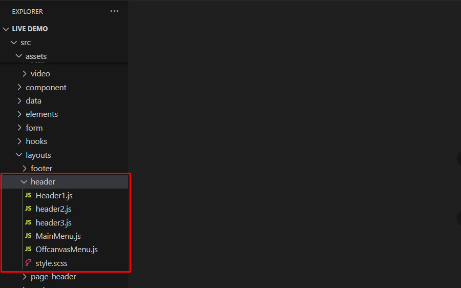
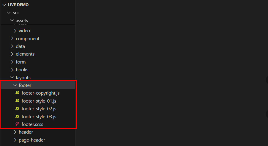
-layouts |
All components source folder. |
--footer |
All footers source folder. |
--header |
All headers source folder. |
--page-header |
page-header source folder. |
--topbar |
topbar source folder. |
-pages |
All the pages available in the theme. |
-template |
All components source folder. |
-widget |
All Widget source folder. |
--app.js |
Main application js File |
--index.css |
The index.html lives at the root of the front-end structure. |
--index.js |
Whenever an application is run, First index.js file is a load. |
package-lock.json |
A package.json file contains metadata about app or module. Most importantly, it includes the list of dependencies. |
package.json |
A package.json file contains metadata about app or module. Most importantly, it includes the list of dependencies. |
Installation
This section guides you to install all required software and libraries to utilize Car-Dealer for your projects fully.
Node
Node.js® is a JavaScript runtime built on Chrome’s V8 JavaScript engine. Node.js is required to build the Car-Dealer React. Download the latest version of Node and install it: Download Nodejs
NPM
Npm is the package manager for JavaScript and the world’s largest software registry. Npm is a separate project from Node.js and tends to update more frequently. As a result, even if you’ve just downloaded Node.js (and therefore npm), you’ll probably need to update your npm.
npm install --global npm@latest
Verify that npm in successfully installed, and version of installed npm will appear
npm --version
React
Installation
1. First, unzip the zip file that you have download from ThemeForest. You will find a Car-Dealer-react project and readme file.
2. Then after Extract zip File (Car-Dealer-react.zip) into a folder, you have to work within.
3. Open a Node Prompt. Go to your Working Folder, And run the Following Command and wait for finish installation.
npm install
4. This command will install all the required node module into node_module/ inside your working folder.
5. You are ready to run the react-Car-Dealer application for the first time
Working With React-Car-Dealer
While still your working folder And run the following command
npm start
Global Setting
This section covers global elements which are used throughout in application.
Main Logo
To change logo go to the layout directory inside of the component directory. Open layout directory and open inheader.js add below code.
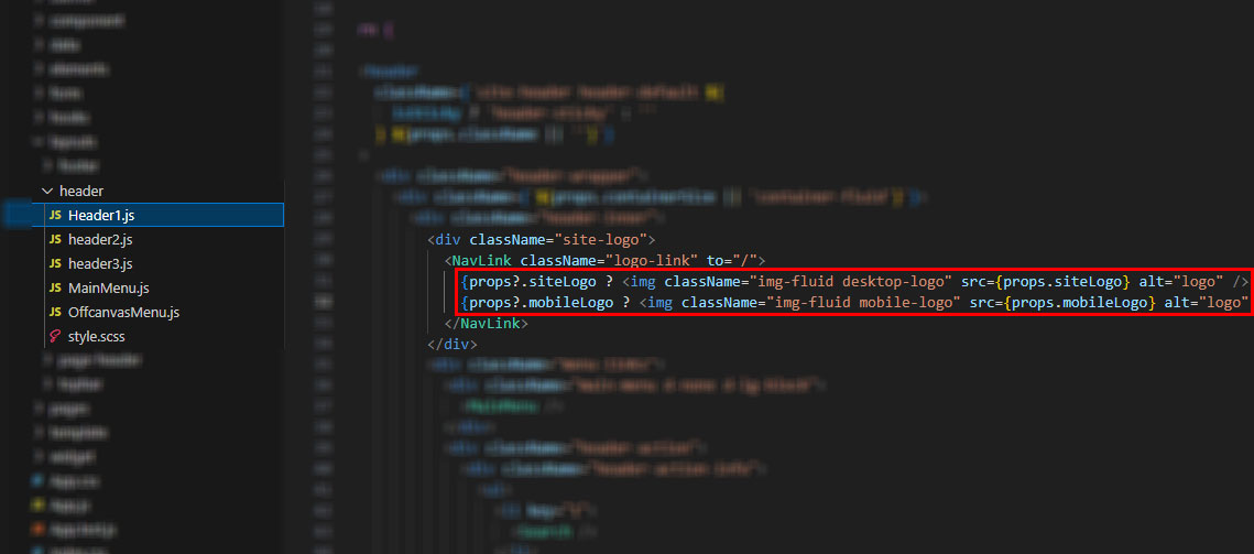
Site Header
Here are some Header related components to make a header the way you like.
If you want to make Header change on all Pages, you can just change some setting on Header Route in App.js.
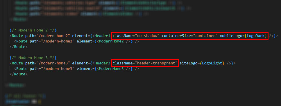
You can just follow below Step in App.js in Route.
- For Container size header use containerSize "container".
- For Full width header container use containerSize "container-fluid".
- For Desktop Logo siteLogo and Add Logo Image.
- For Mobile Logo mobileLogo and Add Logo Image.
Note: If you don't added above all option in Header Route, then Default Setting apply automatically.
Site Footer
Here are some Footer related components to make a footer the way you like.
Page Header
Here are change Page Header area by components. The list of page title options & their descriptions are provided below for your reference:
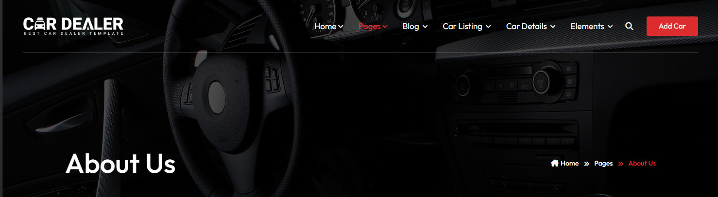
1. Import Page Header component from below file.
import PageHeader from "../../layouts/page-header/PageHeader";
2. See below Code - structure to use Page Header Component.
<PageHeader
          title="About Us"
          breadCrumbItems={[
            { label: 'Home', path: '/' },
            { label: 'Pages', path: '#' },
            { label: 'About Us', path: '#', active: true },
          ]}
        />
- Hide Background Image by use this code : bgImageHide={true}
- Change Page Header Theme Color by use this code : theme="primary", theme="dark", theme="light"
- Remove "breadCrumbItems" to Hide Breadcrumb area.
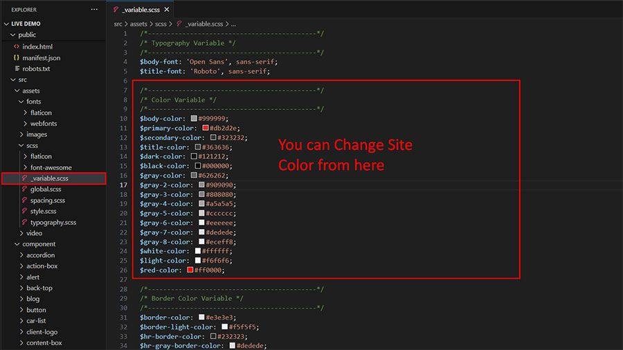
Global Color
Here are some Footer related components to make a footer the way you like.
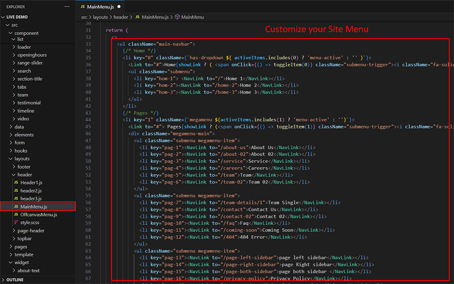
Main Menu
Here you can Customize Main Menu, go to the location by following screenshot which are given bellow.
Components
Car-Dealer comes with many different types of reusable components making it easier to manage and maintain large-scale applications. This section will explain to you how to use them in your Theme.
Action Box
If you want to use an Action Box component in your project, you need to follow below steps.
- Import ActionBox component from below file.
import ActionBox from '../component/action-box';
ActionBox
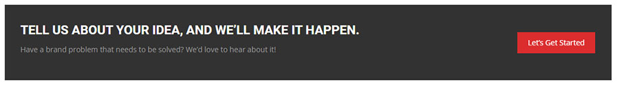
- See below Code - structure to use ActionBox Component.
<ActionBox
    title="Tell us about your idea, and we’ll make it happen."
    content="Have a brand problem that needs to be solved? We’d love to hear about it!"
    btnText="Let’s Get Started"
  />
Note: Here is Demo URL : https://themes.potenzaglobalsolutions.com/react/car-dealer/elements-action-box
Accordion
If you want to use an Accordion component in your project, you need to follow below steps.
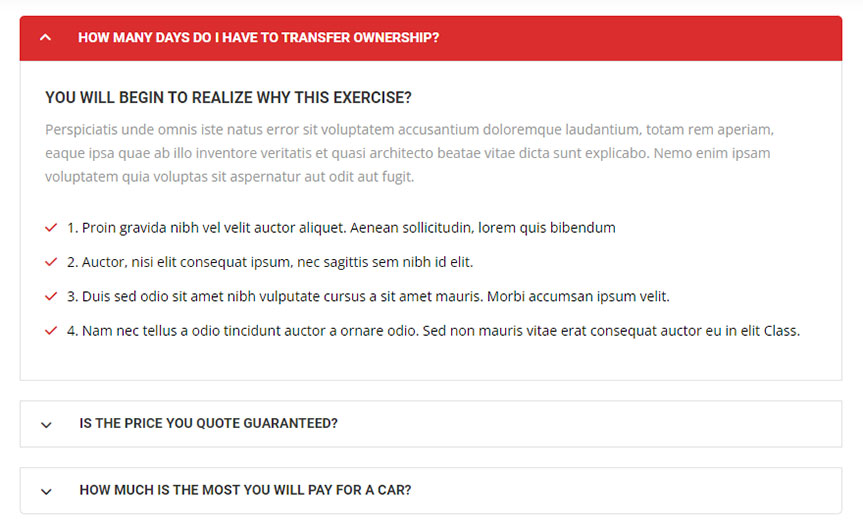
1. Import Accordion component from below file.
import AccordionPGS from "../component/accordion";
2. See below Code - structure to use Accordion data from Seprate Data file.
<AccordionPGS accordionData={FeaturesOptionsfaqData} />
3. See below Code - structure to use Accordion inline data.
<AccordionPGS
    defaultActive="1"
    accordionItems={[
      {
        id: 1,
        title: 'Accordion Title 01',
        content: 'Accordion Content 01',
      },
      { id: 2, title: 'Accordion Title 02', content: data1 },
      {
        id: 3,
        title: 'Accordion Title 03',
        content: 'Accordion Content 03',
      },
    ]}
/>
Note: Here is Demo URL : https://themes.potenzaglobalsolutions.com/react/car-dealer/elements-accordion
Button
If you want to use an Accordion component in your project, you need to follow below steps.
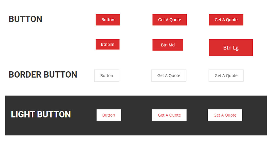
1. Import Button component from below file.
import Button from "../component/button/button";
2. See below Code - structure to use Button Component.
<Button
	btnText="Get A Quote"
	btnURL="/about-us"
/>
- Use btnClass="border" For Button Border Style.
- Use btnClass="secondary" For Button Dark Background.
- Use btnClass="button-white" For Button White Background.
Note: Here is Demo URL : https://themes.potenzaglobalsolutions.com/react/car-dealer/elements-button
Blog
If you want to use an Blog component in your project, We have Created 4 Style for Blog.
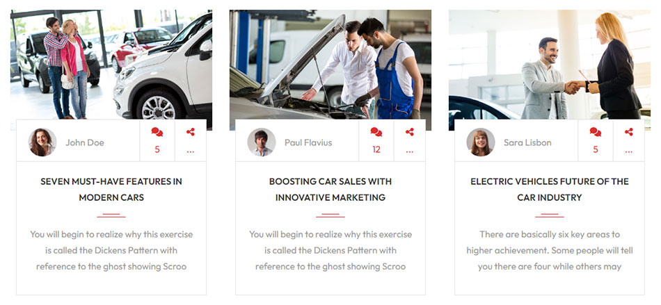
Import Blog component from below file. after import component use below component structure for all Style.
import { PostStyle1, PostStyle2, PostStyle3, PostStyle4 } from "../component/blog";
1. For Blog Style 1 use below Code Structure.
<PostStyle1
	key={ind}
	id={val.id}
	imgSrc={val.imgSrc}
	metaDate={val.metaDate}
	authorName={val.authorName}
	title={val.title}
	bydealer={val.bydealer}
	shortDescription={val.shortDescription.slice(0, 150)}
	mainDescription={val.mainDescription.slice(0, 200) + "..."}
	buttontext="Read More"
/>
2. For Blog Style 2 use below Code Structure.
<PostStyle2
	key={ind}
	id={val.id}
	imgSrc={val.imgSrc}
	authorImg={val.authorImg}
	authorName={val.authorName}
	metaDate={val.metaDate}
	comments={val.comments}
	title={val.title}
	shortDescription={val.shortDescription.slice(0, 115)}
/>
3. For Blog Style 3 use below Code Structure.
<PostStyle3
	key={ind}
	id={val.id}
	imgSrc={val.imgSrc}
	metaDate={val.metaDate}
	category={val.category}
	title={val.title}
/>
4. For Blog Style 4 use below Code Structure.
<PostStyle4
	key={ind}
	id={val.id}
	postType="first-large"
	imgSrc={val.imgSrc}
	metaDate={val.metaDate}
	category={val.category}
	title={val.title}
	shortDescription={val.shortDescription.slice(0, 150)}
/>
Note: Here is All Style Live Demo URL : https://themes.potenzaglobalsolutions.com/react/car-dealer/elements-blog
Vehicle Showcase
If you want to use an Vehicle Showcase component in your project, We have Created 3 Grid Style and 1 List Style for Vehicle Showcase.
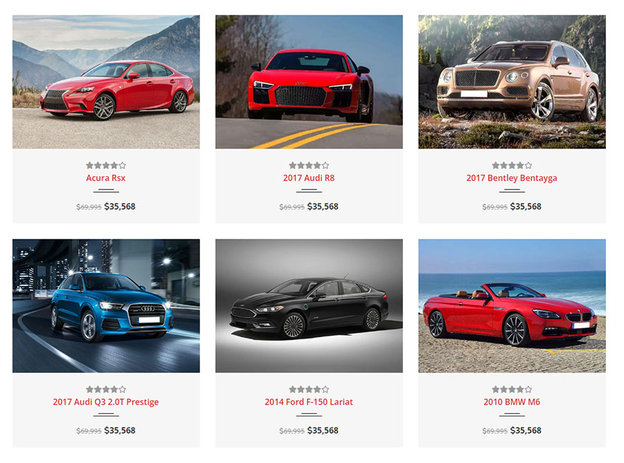
Import Vehicle Showcase component from below file. after import component use below component structure for all Style.
import VehicleShowcase1, {VehicleShowcase2, VehicleShowcase3, CarItemList} from '../component/car-list';
1. For Vehicle Showcase Style 1 use below Code Structure.
<VehicleShowcase1
	className="bg-light"
	key={index}
	imgSrc={val.imgSrc}
	carName={val.carName}
	carPrice={val.carPrice}
	carNewPrice={val.carNewPrice}
	registrationDate={val.registrationDate}
	transmission={val.transmission}
	mileage={val.mileage}
	list={val.review}
	attri={val.attributes}
	id={val.id}
	lightboxImages={val.gallery}
/>
2. For Vehicle Showcase Style 2 use below Code Structure.
<VehicleShowcase2
	className="car-item-grid"
	key={index}
	imgSrc={val.imgSrc}
	carName={val.carName}
	description={val.description}
	carPrice={val.carPrice}
	carNewPrice={val.carNewPrice}
	registrationDate={val.registrationDate}
	transmission={val.transmission}
	mileage={val.mileage}
	horsepower={val.horsepower}
	list={val.review}
	attri={val.attributes}
	id={val.id}
	lightboxImages={val.gallery}
/>
3. For Vehicle Showcase Style 3 use below Code Structure.
<VehicleShowcase3
	className="car-item-grid"
	key={index}
	imgSrc={val.imgSrc}
	carName={val.carName}
	carPrice={val.carPrice}
	carNewPrice={val.carNewPrice}
	registrationDate={val.registrationDate}
	transmission={val.transmission}
	mileage={val.mileage}
	horsepower={val.horsepower}
	attri={val.attributes}
	id={val.id}
	lightboxImages={val.gallery}
/>
4. For Vehicle Showcase List Style use below Code Structure.
<CarItemList
		className="car-item-list"
		key={index}
		imgSrc={val.imgSrc}
		carName={val.carName}
		description={val.description}
		carPrice={val.carPrice}
		carNewPrice={val.carNewPrice}
		registrationDate={val.registrationDate}
		transmission={val.transmission}
		mileage={val.mileage}
		list={val.review}
		id={val.id}
		attri={val.attributes}
		lightboxImages={val.gallery}
/>
Note: Here is All Style Live Demo URL : https://themes.potenzaglobalsolutions.com/react/car-dealer/elements-vehicle-showcase
Client Logo
If you want to use an Client Logo component in your project, you need to follow below steps.
1. Import Client Logo component from below file.
import ClientLogo from "../component/client-logo";
2. See below Code - structure to use Client Logo Component.
<ClientLogo
  key={ind}
  theme="logo-default"
  data={val.imgSrc}
/>
Note: Here is Demo URL : https://themes.potenzaglobalsolutions.com/react/car-dealer/elements-client-logo
Content Box
If you want to use an Content Box component in your project, you need to follow below steps.
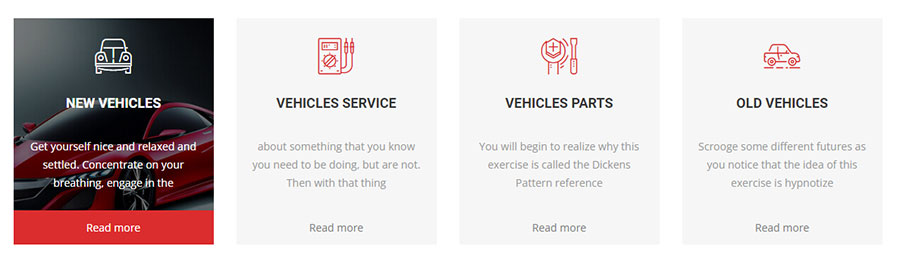
1. Import Content Box component from below file.
import ContentBox, { ContentBox02 } from "../component/content-box/content-box;
2. See below Code - structure to use ContentBoxStyle1 and ContentBoxStyle2 Component.
 <ContentBox
	  className="contentbox-style-01"
	  key={ind}
	  imgsrc={val.imgsrc}
	  icon={val.icon}
	  title={val.title}
	  description={val.description}
	  id={val.id}
	  servicesurl={val.servicesurl}
	/>
<ContentBox02
    className="contentbox-style-02"
    key={ind}
    imgsrc={val.imgsrc}
    icon={val.icon}
    title={val.title}
    description={val.description}
    id={val.id}
    servicesurl={val.servicesurl}
  />
Note: Here is Demo URL : https://themes.potenzaglobalsolutions.com/react/car-dealer/elements-content-box
Counter
If you want to use an Counter component in your project, you need to follow below steps.
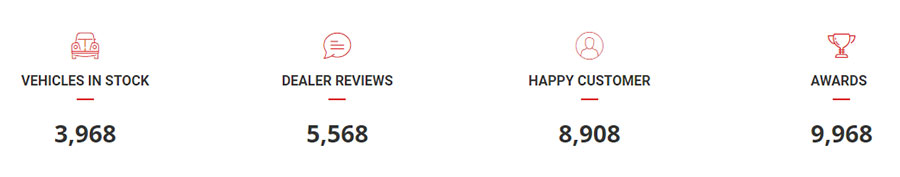
1. Import Counter component from below file.
import Counter, { CounterstyleTwo, CounterstyleThree,} from "../component/counter/counter";
2. See below Code - structure to use Counter Component.
<Counter
  className=""
  countStart="0"
  countEnd="3968"
  countIcon="glyph-icon flaticon-beetle"
  countTitle="Vehicles In Stock"
/>
3. See below Code - structure to use Counter Style 2 Component.
<CounterstyleTwo
  className="counterstyle-02"
  countStart="0"
  countEnd="400"
  countIcon="glyph-icon flaticon-beetle"
  countTitle="Vehicles Stock"
/>
4. See below Code - structure to use Counter Style 3 Component.
<CounterstyleThree
  className="counterstyle-03"
  countStart="0"
  countEnd="561"
  countIcon="glyph-icon flaticon-beetle"
  countTitle="Vehicles in Stock"
/>
Note: Here is Demo URL : https://themes.potenzaglobalsolutions.com/react/car-dealer/elements-counter
Countdown
If you want to use an Countdown component in your project, you need to follow below steps.
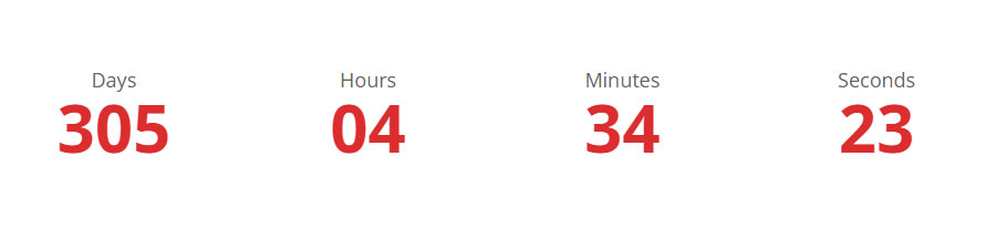
1. Import Countdown component from below file.
import Countdown from '../component/countdown/countdown';
2. See below Code - structure to use Countdown Component.
<Countdown
	size="size-lg"
	dateTime="12/31/2024"
/>
Note: Here is Demo URL : https://themes.potenzaglobalsolutions.com/react/car-dealer/elements-countdown
Feature Info
If you want to use an Feature Info component in your project, you need to follow below steps.
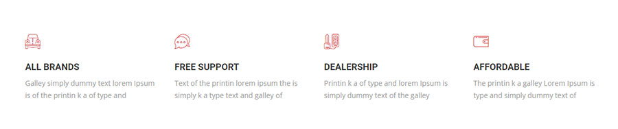
1. Import Feature Info component from below file.
import FeatureInfo from "../component/feature-info";
2. See below Code - structure to use Feature Info Component.
<FeatureInfo
  icon="glyph-icon flaticon-beetle"
  title="All brands"
  content="Galley simply dummy text lorem Ipsum is of the printin  k a of type and"
  link="#"
/>
- Use feature-box-style-01 class for Feature Box Style 1.
- Use feature-box-style-02 class for Feature Box Style 2.
- Use feature-box-style-03 class for Feature Box Style 3.
- Use feature-box-hover class for Feature Box Hover.
- Use feature-box-style-03 grey-border class for Feature Box Style 3 Icon Grey Border.
Note: Here is Demo URL : https://themes.potenzaglobalsolutions.com/react/car-dealer/elements-feature-info
Infobox
If you want to use an Infobox component in your project, you need to follow below steps.
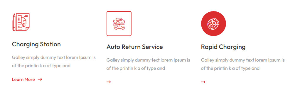
1. Import Infobox component from below file.
import InfoBox from '../component/infobox';
2. See below Code - structure to use Infobox Component.
<InfoBox
	icontype="default"
	iconshape="default"
	icon="glyph-icon flaticon-travel"
	title="Charging Station"
	description="Galley simply dummy text lorem Ipsum is of the printin k a of type and"
	linktext="Learn More"
	linkurl="/"
/>
- Use infoStyle="style-2" class for Infobox Style 2.
- Use infoStyle="style-3" class for Infobox Style 3.
- Use icontype="" for Infobox Icon Style. and add class name default, flat, border
- Use iconshape="" for Infobox Icon Shape. and add class name default, round, rounded
Note: Here is Demo URL : https://themes.potenzaglobalsolutions.com/react/car-dealer/elements-infobox
Testimonial
If you want to use an Testimonial component in your project, you need to follow below steps.
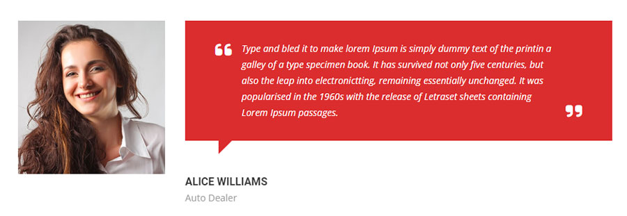
1. Import Testimonial component from below file.
import TestimonialStyle1, {TestimonialStyle2,TestimonialStyle3,} from "../component/testimonial/testimonial-item";
2. See below Code - structure to use Testimonial Style 1 Component.
<TestimonialStyle1
  key={ind}
  testimonialImg={val.testimonialImg}
  authorImg={val.authorImg}
  authorName={val.authorName}
  authorPosition={val.authorPosition}
  description={val.description}
  icon={val.icon}
/>
3. See below Code - structure to use Testimonial Style 2 Component.
<TestimonialStyle2
  key={ind}
  authorImg={val.authorImg}
  authorName={val.authorName}
  authorPosition={val.authorPosition}
  icon={val.icon}
  description={val.description}
/>
4. See below Code - structure to use Testimonial Style 3 Component.
<TestimonialStyle3
  key={ind}
  authorImg={val.authorImg}
  authorName={val.authorName}
  authorPosition={val.authorPosition}
  icon={val.icon}
  iconLeft={val.iconLeft}
  description={val.description}
/>
Note: Here is Demo URL : https://themes.potenzaglobalsolutions.com/react/car-dealer/elements-testimonial
Team
If you want to use an Team component in your project, you need to follow below steps.
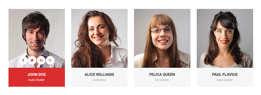
1. Import Team component from below file.
import TeamStyle1, { TeamStyle2 } from "../component/team/team-item";
2. See below Code - structure to use Team Component.
<TeamStyle1
  key={index}
  image={val.image}
  name={val.name}
  position={val.position}
  list={val.social}
  id={val.id}
/>
3. See below Code - structure to use Team Style 2 Component.
<TeamStyle2
  key={index}
  image={val.image}
  name={val.name}
  position={val.position}
  list={val.social}
  id={val.id}
  description={val.description}
/>
Note: Here is Demo URL : https://themes.potenzaglobalsolutions.com/react/car-dealer/elements-team
Tabs
If you want to use an Tabs component in your project, you need to follow below steps.
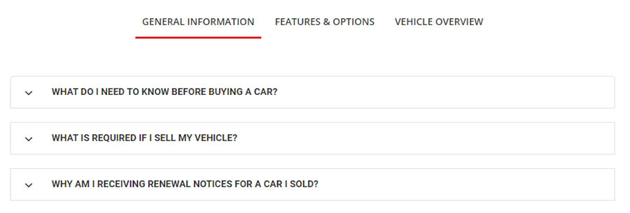
1. Import Tabs component from below file.
import TabsPGS from "../component/tabs/tabs";
2. See below Code - structure to use Tabs Component.
<TabsPGS
  extraClass="justify-content-center"
  tabActive="0"
  tabsTitle={[
    { id: 1, title: 'General Information' },
    {id: 2, title: 'Features & Options', },
    {id: 3, title: 'Vehicle Overview',},
  ]}
  tabsContent={[
    { id: 31, content: data1 },
    { id: 32, content: data2 },
    { id: 33, content: data3 },
  ]}
/>
Note: Here is Demo URL : https://themes.potenzaglobalsolutions.com/react/car-dealer/elements-tab
Timeline
If you want to use an Timeline component in your project, you need to follow below steps.
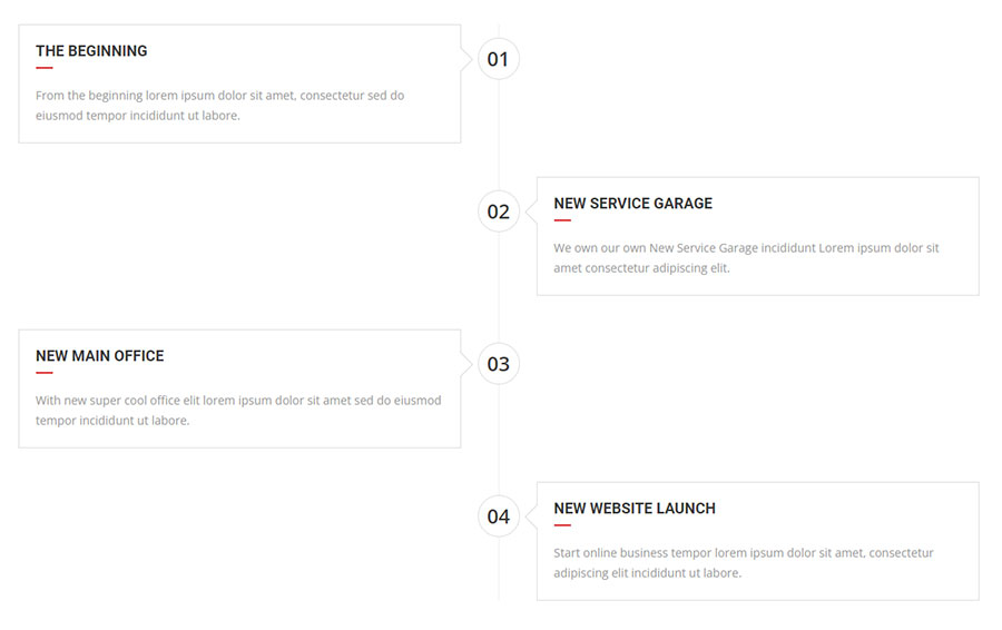
1. Import Timeline component from below file.
import Timeline from '../component/timeline/timeline';
2. See below Code - structure to use Timeline Component.
<Timeline
  key={ind}
  extraClass=""
  featureImg={val.featureImg}
  stepNumber={val.stepNumber}
  title={val.title}
  description={val.description}
/>
Note: Here is Demo URL : https://themes.potenzaglobalsolutions.com/react/car-dealer/elements-timeline
Image Gallery
If you want to use an Image Gallery component in your project, you need to follow below steps.
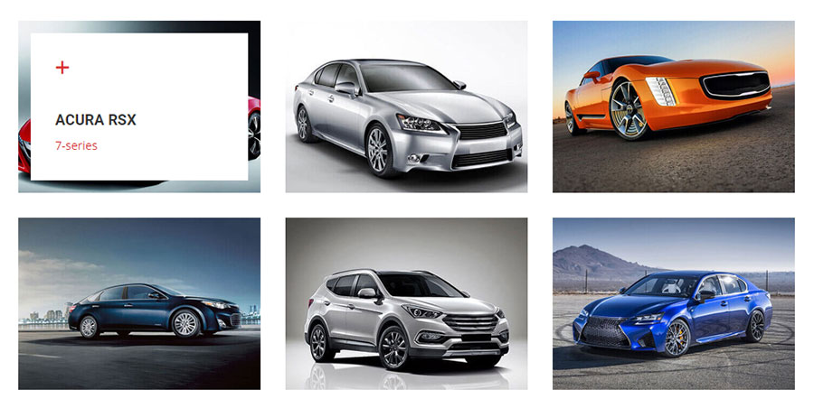
1. Import Image Gallery component from below file.
import ImageGallery from '../component/image-gallery';
2. Import Image Gallery Data file from below location.
import ImageGalleryList, { ImageGalleryList2 } from '../data/image-gallery'
3. See below Code - structure to use ImageGallery Component.
<ImageGallery
  items="6"
  theme="gallery-style-1"
  data={ImageGalleryList}
/>
- Set ImageGallery total items by items="6"
- Use theme="gallery-style-2" for Image Gallery Style 2.
Note: Here is Demo URL : https://themes.potenzaglobalsolutions.com/react/car-dealer/elements-image-gallery
List
If you want to use an List component in your project, you need to follow below steps.
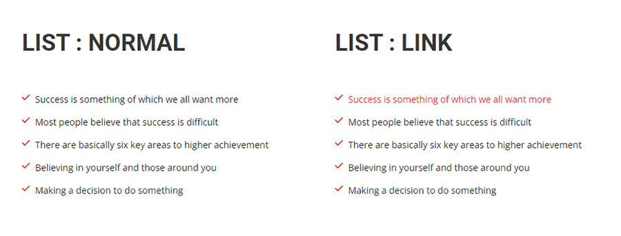
1. Import List component from below file.
import List from "../component/list";
2. See below Code - structure to use List Component.
<List
	icon="fas fa-check"
	link={true}
	data={listItems}
/>
- Add/Update Icon by icon="fas fa-check" code.
- Desable List Link then Remove link={true} code.
Note: Here is Demo URL : https://themes.potenzaglobalsolutions.com/react/car-dealer/elements-list
Vehicles Type
If you want to use an Vehicles Type component in your project, you need to follow below steps.
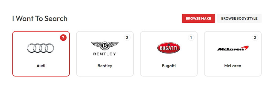
1. Import Vehicles Type component from below file.
import VehiclesType from '../component/vehicles-type';
2. See below Code - structure to use Vehicles Type Component.
<VehiclesType
	className="vehicles-type-style-1"
	title="I Want To Search"
	tabActive="0"
	tabsType={[
	  { id: 1, title: 'Browse Make' },
	  { id: 2, title: 'Browse Body Style' },
	]}
	tabsContent={[
	  { id: 11, content: make },
	  { id: 12, content: body },
	]}
/>
- Use className="vehicles-type-style-2" for Vehicles Type Style 2.
- Add Tab Custom Title in "tabsType".
- Add Dynamic Data in "tabsContent".
Note: Here is Demo URL : https://themes.potenzaglobalsolutions.com/react/car-dealer/elements-vehicles-type
Vehicles Search
If you want to use an Vehicles Search component in your project, you need to follow below steps.
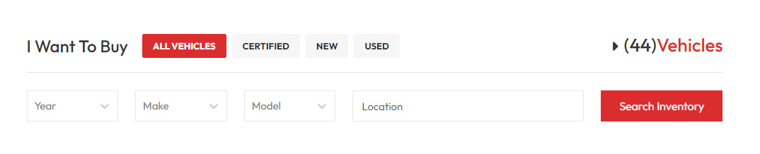
1. Import Vehicles Search component from below file.
import VehiclesSearch from '../component/vehicles-search';
2. See below Code - structure to use Vehicles Search Component.
<VehiclesSearch
	className="vehicles-search-style-1"
	title="I Want To Buy"
	tabActive="0"
	tabsTitle={[
	  { id: 1, title: 'All vehicles' },
	  { id: 2, title: 'Certified' },
	  { id: 3, title: 'New' },
	  { id: 4, title: 'Used' },
	]}
	tabsContent={[
	  { id: 11, content: data1 },
	  { id: 12, content: data1 },
	  { id: 13, content: data1 },
	  { id: 14, content: data1 },
	]}
/>
- Use className="vehicles-search-style-2" for Vehicles Search Style 2.
- Add Tab Custom Title in "tabsTitle".
- Add Dynamic Data in "tabsContent".
- Use "tabActive" index for Default Active Tab.
Note: Here is Demo URL : https://themes.potenzaglobalsolutions.com/react/car-dealer/elements-vehicles-search
Video
If you want to use an Video component in your project, you need to follow below steps.
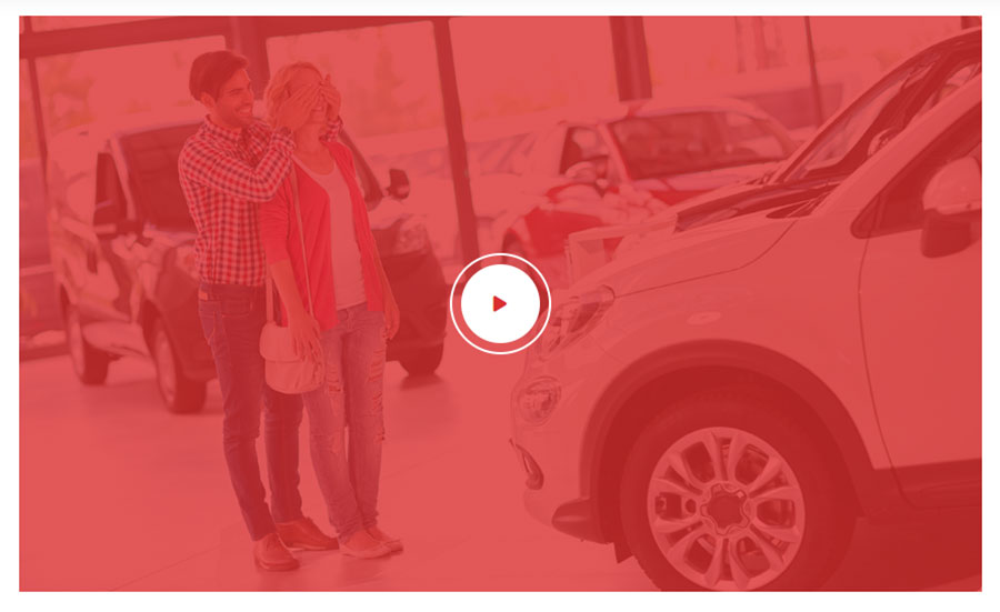
1. Import Video component from below file.
import VideoPopup from "../component/video";
2. See below Code - structure to use Video Component.
<VideoPopup
  theme="video-info "
  videoURL="https://www.youtube.com/embed/LgvseYYhqU0"
  videoImage={videoImg}
/>
Use theme="video-style-2" for without Image.
Use size="lg" to Change Video PopUp Size.
Add Video URL in videoURL="" code.
Note: Here is Demo URL : https://themes.potenzaglobalsolutions.com/react/car-dealer/elements-video
Browser Support
car-dealer supports all major Browsers like Google Chrome, Mozilla Firefox, Safari, Opera and Internet Explorer 10+.
How to rate this item
If you like our theme and support, Please do not forget to rate it with 5 stars in your Downloads section and write a review in Comments as it will add more value to our services!
Kindly visit here: http://themeforest.net/downloads and find “Rate this item” below the download button and rate out the theme.
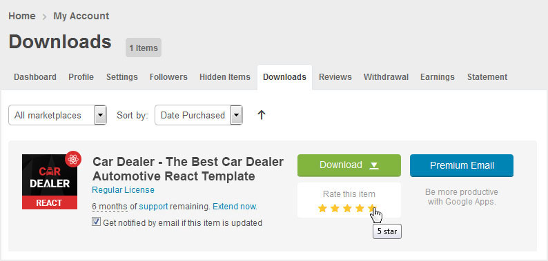
Advance Thanks in Anticipation!
Change log
Version 1.0.0 - Released on 01 June 2023
- Initial Release
Source & Credits
Images
- Shutterstock Shutterstock
- Pexels Pexels
- Unsplash Unsplash
React Scripts
- react
- react-router-dom
- React Bootstrap
- react-18-image-lightbox
- react-countup
- react-scroll-trigger
- swiper