

Header, sticky header, secondary header with sticky and multiple footer options.
Bootstrap based Responsive Mega Menu with Multi-level dropdowns - add any code in dropdowns
Hi-Soft supports all major browsers like Google Chrome, Mozilla Firefox, Opera, Microsoft Edge, Internet Explorer 11 and Above.

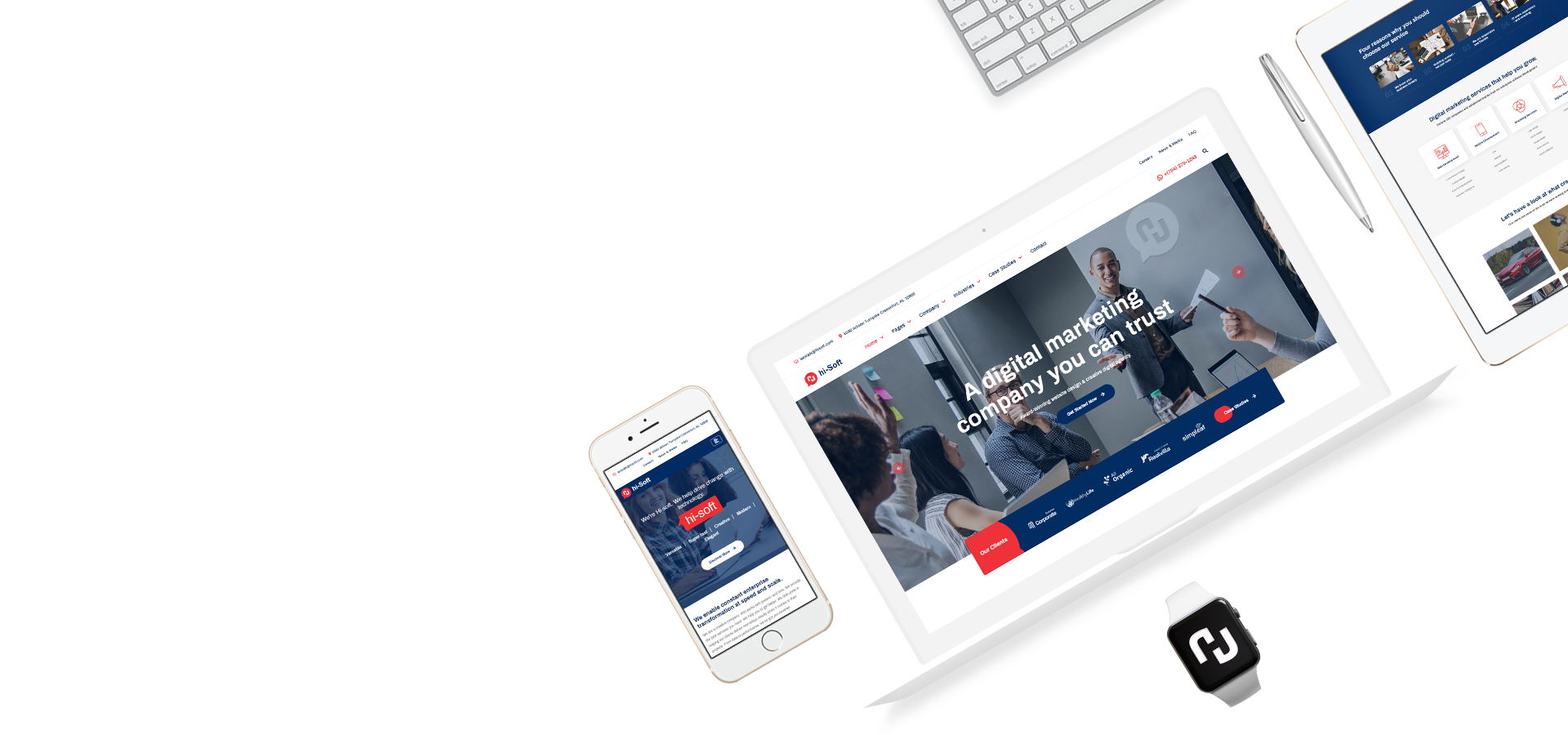
Hi-Soft automatically resizes to fit the different screen sizes and make it look great on all devices.
We built Hi-Soft to be the ultimate HTML5 and CSS3 template with clean, clear, commented and customizable code.
Instantly design your pages just by adding your content to those pre-made pages. You can also create new pages using shortcodes & widgets.

Speed up your development process with our included npm scripts to automate your time-consuming tasks in your development workflow with Grunt toolkit.
If you are not familiar with grunt or SASS you can also prefer simple CSS changes method as well.
The Hi-Soft Documentation has been carefully detailed and completed with super easy to understand instructions giving you the full access to all of its features. Our Documentation will give you an understanding of how The Hi-Soft is structured and guide you in performing common functions.
Buy once, get free lifetime updates
11000+ Sales
Loved by Customers
Accurate Design & Code