
Introduction
Author: Potenza Global Solutions
This documentation will give you an understanding of how Guruma template is structured and guide you in performing common functions.
Notes:
- We will not respond to any support questions on Item comment section or through e-mail. If this document doesn’t answer your questions feel free to open up a private ticket in our support forum
- For questions on basic HTML, Javascript or CSS editing – please give your question a quick Google or visit W3Schools as template issues get top priority.
- You will need some basic knowledge of HTML/CSS to edit the template.
- For customization service contact us at our support forum
Installation
Follow the steps below to get started with your Site Template:
- Open the
... /templateFolder to find all the Templates Files - You will need to Upload these files to your Web Server using FTP (We suggest Filezilla) to use it on your Website.
- Make sure you upload the required files/folders listed below:
template/css– Stylesheets Foldertemplate/fonts– Fonts Foldertemplate/images– Images Foldertemplate/js– Java Scripts Foldertemplate/scss– All SCSS Filestemplate/index.html– Main home filetemplate/.....– All HTML files
The other files can be used according to your preferences.
- You’re now good to go..! Start editing your site and show off your Brand New Website with proud.
Note: For correct operation of all functions of the template, including Popup video and Contact forms, you must upload the template to the web-server.
Basic template Structure
The template has a responsive layout and is based on the Bootstrap 4 Framework. Bootstrap is the most popular HTML, CSS, and JS framework for developing responsive, mobile-first projects on the web. Click Here to know more about Bootstrap.
HTML Structure
Here is the general HTML structure of the template:
<!DOCTYPE html>
<html lang="en">
<head>
  [Page meta, page css, page title etc...]
</head>
<body>
<!--header -->
<header class="header header-sticky default-transparent">
  <nav class="navbar navbar-static-top navbar-expand-lg px-3 px-md-5">
    [MENU CONTENT]
  </nav>
</header>
<!--header -->
<!-- Banner -->
<section class="slider-01">
  [BANNER CONTENT]
</section>
<!-- Banner -->
<!--Section 1 -->
<section class="bg-primary">
  [SECTION 1 CONTENT]
</section>
<!--Section 1 -->
<!--Section 2 -->
<section class="space-ptb">
  [SECTION 2 CONTENT]
</section>
<!--Section 2 -->
<!--footer -->
<footer class="footer">
  [FOOTER CONTENT]
</footer>
<!--footer -->
  [PAGE JAVASCRIPTS HERE]
</body>
</html>
CSS Structure
Here is the general CSS structure of the template:
<!-- CSS Global Compulsory (Do not remove)-->
<link rel="stylesheet" href="css/font-awesome/all.min.css" />
<link rel="stylesheet" href="css/flaticon/flaticon.css" />
<link rel="stylesheet" href="css/bootstrap/bootstrap.min.css" />

<!-- Page CSS Implementing Plugins (Remove the plugin CSS here if site does not use that feature) -->
<link rel="stylesheet" href="css/select2/select2.css" />
<link rel="stylesheet" href="css/owl-carousel/owl.carousel.min.css" />
<link rel="stylesheet" href="css/animate/animate.min.css"/>
<link rel="stylesheet" href="css/swiper/swiper.min.css" />
<link rel="stylesheet" href="css/magnific-popup/magnific-popup.css" />
<!-- Template Style -->
<link rel="stylesheet" href="css/style.css" />
- all.min.css: This is a Font-awesome CSS.
- flaticon.css: This is a Flaticon font icon CSS.
- bootstrap.min.css: This is a Bootstrap 4 CSS file. You must need this file. Do not remove this.
- select2.css: This is an select2 plugins CSS.
- owl.carousel.min.css: This is an owl carousel plugins CSS.
- animate.min.css: This is an animate plugins CSS.
- swiper.min.css: This is an swiper slider plugins CSS.
- magnific-popup.css: This is a magnific popup plugins CSS.
- style.css: This is a main stylesheet of the template, This file contains the styling for the actual Template.
Javascript Structure
Here is the general Javascript structure of the template:
<!-- JS Global Compulsory (Do not remove)-->
<script src="js/jquery-3.4.1.min.js"></script>
<script src="js/popper/popper.min.js"></script>
<script src="js/bootstrap/bootstrap.min.js"></script>

<!-- Page JS Implementing Plugins (Remove the plugin script here if site does not use that feature)-->
<script src="js/select2/select2.full.js"></script>
<script src="js/owl-carousel/owl.carousel.min.js"></script>
<script src="js/swiper/swiper.min.js"></script>
<script src="js/swiperanimation/SwiperAnimation.min.js"></script>
<script src="js/shuffle/shuffle.min.js"></script>
<script src="js/jarallax/jarallax.min.js"></script>
<script src="js/magnific-popup/jquery.magnific-popup.min.js"></script>

<!-- Template Scripts (Do not remove)-->
<script src="js/custom.js"></script>
- jquery.js: This is a JavaScript library file. You must need this file to run any javascript. Do not change or edit this file.
- popper.min.js: This is popper plugins file. Use to Tooltip. Do not change or edit this file.
- bootstrap.min.js: This is a bootstrap plugins file. Use to Bootstrap Library JavaScript. Do not change or edit this file.
- select2.full.js: This is a select2 plugins file. Use to convert select tag to ul tag. Do not change or edit this file.
- owl-carousel.min.js: This is owl-carousel plugins file. Use to Banner slider. Do not change or edit this file.
- swiper.min.js: The swiper slider plugins file. Used for Banner Slider. Do not change or edit this file
- SwiperAnimation.min.js: The wiper slider animation plugin file. Used for Banner Slider animation. Do not change or edit this file
- shuffle.min.js: This is a shuffle plugins file. Use to fillers course. Do not change or edit this file.
- jarallax.min.js: This is a jarallax plugins file. Use to parallax background-images. Do not change or edit this file.
- jquery.magnific-popup.min.js: This is a magnific-popup plugins file. Use to images popup and popup slider. Do not change or edit this file.
- custom.js: This File includes all small scripts from the template. All script has commented code so you can easily remove unnecessary code from this file. Make sure you remove/add proper files before you remove or add anything in this file.
Compiling SCSS
Overview
SCSS is perhaps the most popular of the CSS pre-processors; for years it’s helped us write clean, reusable and modular CSS. In this quick tutorial, I’ll cut straight to the stuff that matters and explain how to compile Sass into CSS using the command line.
Install Node.js
To compile Sass via the command line, first, we need to install node.js. Download it from the official website nodejs.org, open the package and follow the wizard.
Gulp
Gulp is the task manager that is used to automate the task for easy development. Guruma is divided into different parts for which different gulp task is created.
1. If you have not installed gulp globally then please it using the below command.
npm install gulp-cli -g
2. Now install all the dependencies required for the project go inside the folder where /gulpfile.js located and run below command.
npm install
This will install all the dependencies from the package manager.
3. Run the project using below command this will process all the scss files and js files and will auto start the browser.
gulp
Favicon icon
Favicon is an icon associated with the URL that is displayed at various places, such as in a browser’s address bar or next to the site name in a bookmark list. There are many online favicon icon generators to generate .ico file. You can also use .png file
You can add a Favicon to your Website using the following code:
<link rel="shortcut icon" href="images/favicon.ico" />
Logo Settings
The Logo can be found in the Header – .header. Replace "logo.svg" with your own logo image.
<a class="navbar-brand" href="index.html">
  <img class="img-fluid" src="images/logo.svg" alt="logo">
</a>
How to change logo height?
You can set the height according to your logo type and your requirement.
CSS
To set logo height open css/style.css file and change height value in .header.default .navbar-brand img class, default value of logo height is 48px.
For responsive logo height open css/style.css file and change height value in .header.default .navbar-brand img class in the 991 media query, the default value of logo height in responsive is 40px.
SCSS
To set logo height open scss/header.scss file and change height value in .header.default .navbar-brand img class, default value of logo height is 48px.
For responsive logo height open scss/responsive.scss file and change height value in .header.default .navbar-brand img class in the 991 media query, the default value of logo height in responsive is 40px.
If you change logo height then header height will automatically increase and the menu will set vertically center.
Color Schemes
You can change your Website’s Color Scheme in an instant. There are 2 super easy options to change your website color.
1. CSS method: If you want to change the color go to (css/style.css) and Replace primary color HEX code with your color HEX code. Default color HEX code is #88c250
2. SCSS method: If you want to change the color go to (scss/variables.scss) and change color HEX codes as per your needs.
$body-color:	 #666666; (ex: change color code #f5f5f5 )
$primary:			#88c250;
$white:				#ffffff;
Changing Fonts
You can add/change the site font, from all fonts used from Google Web Font Services, with the one that suits you the best. You can find the font code in the head a tag of all HTML files:
<!-- font -->
<link rel="stylesheet" href="https://fonts.googleapis.com/css2?family=Rubik:wght@300;400;500;700;900&display=swap" >
To include a new font you can simply add another line like this:
<link href="https://fonts.googleapis.com/css?family=Roboto:400,400i,500,500i,700,700i" rel="stylesheet">
Or add an | separator and paste Roboto:400,300,800,700,600 after default website fonts link.
CSS
Now open css/style.css and change your font family with the current.
To change the fonts, you will need to edit the above links with your custom font, if you plan to use a Google Font or remove it completely. If you plan to use a self-hosted font, here is an example of using Self Hosted Fonts
SCSS
Now open scss/variables.scss and change your font family with the current.
To change the fonts, you will need to edit the above links with your custom font, if you plan to use a Google Font or remove it completely. If you plan to use a self-hosted font, here is an example of using Self Hosted Fonts
Map course
How to add property course on the map?
To add your course on the map, open file ..js/map/map-script.js file and add/edit your property details. You can find all the instructions in map-script.js file about course details, changing map center latitude longitude, zoom level etc.
How to place map on the page?
To place map on any page, you need to add below HTML structure.
<section class="course-map">
  <div class="map-canvas">
  </div>
</section>
Make sure you add below scripts on the same page to make map work.
<!-- map -->
<script src="js/map/handlebars.min.js"></script>
<script type="text/javascript" src="https://maps.googleapis.com/maps/api/js?sensor=false&key=AIzaSyCykRLEzpOdEoBqafqgeaJwgjxd3cT1bM8"></script>
<script src="js/map/snazzy-info-window.min.js"></script>
<script src="js/map/map-script.js"></script>

<div class="course-img"><div class="course-item-map-img" style="background-image: url({{{bgImg}}})"></div></div>
<div class="course-item-map">
  <h6 class="course-item-map-title">
  <a href="{{link}}">{{title}}</a>
  </h6>
  <div class="course-item-map-content">{{{body}}}</div>
</div>
Sticky header
When you scroll down, the Sticky Header “sticks” to the top of the window.
To enable the sticky header, you need to add header-sticky class in nav tag of all html files. Please see below code example:
<header class="header header-sticky default-transparent">
</header>
Page section padding
You can add this helper class to set section padding top 100px and padding bottom 100px.
Add space-ptb class in section tag. See example below:
<section class="... space-ptb">
  [YOUR CONTENT]
</section>
Note Use this helper class to maintain all page section spacing. You can also use space-pt for only padding top and space-pb for only padding bottom.
Text color
You can use color in the Text. simply add text-primary class where you want to apply green (theme color) color. See example below:
<div class="text-primary">
  [YOUR TEXT CONTENT]
</div>
Note We followed bootstrap helper class in our template. So you can use any bootstrap helper classes in our template as per your need. For text color, you can use bootstrap color helper classes
Background color
To use background color simply add bg-primary class where you want to apply green (theme bg color) color. See example below:
<div class="bg-primary">
  [YOUR TEXT CONTENT]
</div>
Note We followed bootstrap helper class in our template. So you can use any bootstrap helper classes in our template as per your need. For background color, you can use bootstrap Background color helper classes
Background Images
You can use an image in the background with parallax effect with simply add InlineStyle in any tag and by use of this you can create your own bg. See example below:
<div style="background-image:url(Path); ">
  [YOUR CONTENT]
</div>
If you want to use your background like cover or cointainer so, you just add styling property background-size and set the value cover or cointainer. see the example below:
<div style="background-image:url(Path); background-size:cover;">
  [YOUR CONTENT]
</div>
Background parallax
You can use an image in the background with parallax effect with simply add Inline Data See example below:
<section class="bg-holder" data-jarallax='{"speed": 0.6}' style="background-image:url(Path)">
</section>
Note You must need bg-holder class to set background parallax. With data-jarallax='{"speed": 0.6} you can set parallax speed.
Background overlay
You can add bg-overlay-black-10 class to any element in your HTML code to apply overlay color on any image or any section. See example below:
<div class="bg-overlay-black-10">
  [YOUR CONTENT]
</div>
Here are some predefined overlay classes you can use:
| Class | Description | Class | Description |
|---|---|---|---|
bg-overlay-black-10 |
Apply black color overlay with 0.10 overlay | bg-overlay-black-20 |
Apply black color overlay with 0.20 overlay |
bg-overlay-black-30 |
Apply black color overlay with 0.30 overlay | bg-overlay-black-40 |
Apply black color overlay with 0.40 overlay |
bg-overlay-black-50 |
Apply black color overlay with 0.50 overlay | bg-overlay-black-60 |
Apply black color overlay with 0.60 overlay |
bg-overlay-black-70 |
Apply black color overlay with 0.70 overlay | bg-overlay-black-80 |
Apply black color overlay with 0.80 overlay |
bg-overlay-black-90 |
Apply black color overlay with 0.90 overlay | ||
bg-overlay-white-10 |
Apply white color overlay with 0.10 overlay | bg-overlay-white-20 |
Apply white color overlay with 0.20 overlay |
bg-overlay-white-30 |
Apply white color overlay with 0.30 overlay | bg-overlay-white-40 |
Apply white color overlay with 0.40 overlay |
bg-overlay-white-50 |
Apply white color overlay with 0.50 overlay | bg-overlay-white-60 |
Apply white color overlay with 0.60 overlay |
bg-overlay-white-70 |
Apply white color overlay with 0.70 overlay | bg-overlay-white-80 |
Apply white color overlay with 0.80 overlay |
bg-overlay-white-90 |
Apply white color overlay with 0.90 overlay | ||
bg-overlay-theme-20 |
Apply theme color overlay with 0.20 overlay | bg-overlay-theme-50 |
Apply theme color overlay with 0.50 overlay |
bg-overlay-theme-70 |
Apply theme color overlay with 0.70 overlay | bg-overlay-theme-90 |
Apply theme color overlay with 0.90 overlay |
bg-overlay-theme-97 |
Apply theme color overlay with 0.97 overlay |
Note You can create your own helper classes by creating the class in the stylesheet as per your requirement. This helper class only support RGBA color values.
Text align
You can add this helper class to any element in your HTML code to set text-align
| Class | Description |
|---|---|
text-left |
text-align: left; |
text-right |
text-align: right; |
text-center |
text-align: center; |
Label
You can add this helper class to any element in your HTML code to make a badge(lable). Simply add badge and badge-danger (or any class given below) class where you want to add a badge. See example below:
<span class="badge badge-danger">badge name</span>
Here are some default badges you can use or you can make your own badge as per your requirement.
| Class | Description |
|---|---|
badge-primary |
primary badge |
badge-secondary |
secondary badge |
badge-success |
Success badge |
badge-danger |
danger badge |
badge-warning |
Warning badge |
badge-info |
info badge |
badge-light |
light badge |
badge-dark |
dark badge |
Accordion
Use the below code to display accordion:
<div class="accordion mb-3" id="accordion-faq">
  <div class="card">
    <div class="accordion-icon card-header" id="headingOne">
      <h6 class="mb-0">
      <button class="btn" type="button" data-toggle="collapse" data-target="#collapseOne" aria-expanded="true" aria-controls="collapseOne">
      Direct bank transfer
      </button>
      </h6>
    </div>
    <div id="collapseOne" class="collapse show" aria-labelledby="headingOne" data-parent="#accordion-faq">
      <div class="card-body">
        [ Description ]
      </div>
    </div>
  </div>
  <div class="card">
    <div class="accordion-icon card-header" id="headingTwo">
      <h6 class="mb-0">
      <button class="btn collapsed" type="button" data-toggle="collapse" data-target="#collapseTwo" aria-expanded="false" aria-controls="collapseTwo">
      Check payments
      </button>
      </h6>
    </div>
    <div id="collapseTwo" class="collapse" aria-labelledby="headingTwo" data-parent="#accordion-faq">
      <div class="card-body">
        [ Description ]
      </div>
    </div>
  </div>
  <div class="card">
    <div class="accordion-icon card-header" id="headingthree">
      <h6 class="mb-0">
      <button class="btn collapsed" type="button" data-toggle="collapse" data-target="#collapsethree" aria-expanded="false" aria-controls="collapsethree">
      Cash on delivery
      </button>
      </h6>
    </div>
    <div id="collapsethree" class="collapse" aria-labelledby="headingthree" data-parent="#accordion-faq">
      <div class="card-body">
        [ Description ]
      </div>
    </div>
  </div>
  <div class="card">
    <div class="accordion-icon card-header" id="headingfor">
      <h6 class="mb-0">
      <button class="btn collapsed" type="button" data-toggle="collapse" data-target="#collapsefor" aria-expanded="false" aria-controls="collapsefor">
      PayPal
      </button>
      </h6>
    </div>
    <div id="collapsefor" class="collapse" aria-labelledby="headingfor" data-parent="#accordion-faq">
      <div class="card-body">
        [ Description ]
      </div>
    </div>
  </div>
</div>
Counter
Use the below code to display Counter:
Counter 01
<div class="row">
  <div class="col-6 col-sm-6 col-md-3 mb-md-0 mb-3">
    <div class="counter">
      <div class="counter-number">
        <h3 class="timer" data-to="2208" data-speed="2000">2208</h3>
      </div>
      <p class="mb-0 fw-6">Happy Students</p>
    </div>
  </div>
  <div class="col-6 col-sm-6 col-md-3 mb-md-0 mb-3">
    <div class="counter">
      <div class="counter-number">
        <h3 class="timer" data-to="250" data-speed="2000">250</h3>
      </div>
      <p class="mb-0 fw-6">Our Courses</p>
    </div>
  </div>
  <div class="col-6 col-sm-6 col-md-3">
    <div class="counter">
      <div class="counter-number">
        <h3 class="timer" data-to="130" data-speed="2000">130</h3>
      </div>
      <p class="mb-0 fw-6">Our Teachers</p>
    </div>
  </div>
  <div class="col-6 col-sm-6 col-md-3">
    <div class="counter">
      <div class="counter-number">
        <h3 class="timer" data-to="26" data-speed="2000">26</h3>
      </div>
      <p class="mb-0 fw-6">Awards Won</p>
    </div>
  </div>
</div>
Countdown
You can add Countdown Timer to any Page. You can prefer to use Countdown Timer for “Coming Soon Page” or “Product Countdown Page”. Use below code to display countdown Timer:
Countdown 01
<div class="countdown">
  <span class="days">00</span>
  <p class="days_ref">Days</p>
</div>
<div class="countdown">
  <span class="hours">00</span>
  <p class="hours_ref">Hours</p>
</div>
<div class="countdown">
  <span class="minutes">00</span>
  <p class="minutes_ref">Minutes</p>
</div>
<div class="countdown">
  <span class="seconds">00</span>
  <p class="seconds_ref">Seconds</p>
</div>
Countdown 02
<div class="countdown-style-2 pt-3 mb-4 mb-md-5">
  <div class="countdown bg-white ml-0">
    <h2 class="days">00</h2>
    <p class="days_ref mb-0">Days</p>
  </div>
  <div class="countdown bg-white">
    <h2 class="hours">00</h2>
    <p class="hours_ref mb-0">Hours</p>
  </div>
  <div class="countdown bg-white">
    <h2 class="minutes">00</h2>
    <p class="minutes_ref mb-0">Minutes</p>
  </div>
  <div class="countdown bg-white">
    <h2 class="seconds">00</h2>
    <p class="seconds_ref mb-0">Seconds</p>
  </div>
</div>
Also, update date in custom.js file as per your requirement:
  POTENZA.countdownTimer = function () {
  if ($countdownTimer.exists()) {
    $countdownTimer.downCount({
      date: '12/25/2020 12:00:00', // Month/Date/Year HH:MM:SS
      offset: -4
    });
  }
}
Note date: '12/25/2020 12:00:00' is default date and time, you can change it as per your requirement
Testimonials
Use the below code to display testimonials:
Testimonial 01
<div class="item">
  <div class="video-image">
    <img class="img-fluid w-100" src="images/categories/02.jpg" alt="">
    <a class="popup-icon popup-youtube" href="https://www.youtube.com/watch?v=LgvseYYhqU0">
      <i class="fa fa-play"></i>
      <!-- svg start -->
      <div class="svg-item">
        <svg version="1.1" id="Layer_2" xmlns="http://www.w3.org/2000/svg" xmlns:xlink="http://www.w3.org/1999/xlink" x="0px" y="0px"  height="48px" viewBox="0 0 1920 48" style="enable-background:new 0 0 1920 48;" xml:space="preserve">
          <polygon id="XMLID_1_" class="st0" fill="#ffffff" points="1920,48 0,48 0,48 1920,0 "/>
          </svg>
        </div>
        <!-- svg end -->
      </a>
    </div>
    <div class="testimonial-item">
      <div class="testimonial-content">
        <h6 class="text-dark">[ YOUR CONTENT ]</h6>
      </div>
      <div class="testimonial-author">
        <div class="testimonial-name">
          <p class="mb-1 text-primary font-weight-bold">Michael Bean</p>
          <small class="font-weight-bold">Web Developer</small>
        </div>
      </div>
    </div>
  </div>
Testimonial 02
<div class="testimonial-item">
  <div class="author-img">
    <img src="images/avatar/01.jpg" alt="" >
  </div>
  <div class="testimonial-content">
    <p>[ Content ]</p>
  </div>
  <div class="testimonial-author">
    <div class="testimonial-name">
      <p class="mb-1 text-dark font-weight-bold">Michael Bean</p>
      <small>Web Developer</small>
    </div>
  </div>
</div>
Testimonial 03
 <div class="testimonial-style-03">
  <div class="testimonial-info">
    <div class="testimonial-quote">
      <i class="fas fa-quote-left"></i>
    </div>
    <div class="testimonial-content">
      [ Content ]
    </div>
    <div class="testimonial-author">
      <div class="avatar avatar-md">
        <img class="img-fluid " src="images/avatar/04.jpg" alt="">
      </div>
      <div class="testimonial-name">
        <h6>Felica Queen</h6>
        <span class="text-primary">- CEO</span>
      </div>
    </div>
  </div>
</div>
Tabs
Use the below code to display Tabs :
 <ul class="nav nav-tabs" id="myTab" role="tablist">
  <li class="nav-item">
    <a class="nav-link active" id="description-tab" data-toggle="tab" href="#description" role="tab" aria-controls="description" aria-selected="true">Description</a>
  </li>
  <li class="nav-item">
    <a class="nav-link" id="tab-reviews" data-toggle="tab" href="#reviews" role="tab" aria-controls="reviews" aria-selected="false">Reviews (4)</a>
  </li>
  <li class="nav-item">
    <a class="nav-link mb-0" id="custom-tab" data-toggle="tab" href="#custom" role="tab" aria-controls="custom" aria-selected="false">Custom Tab</a>
  </li>
</ul>
<div class="tab-content mt-5" id="myTabContent">
  <div class="tab-pane fade show active" id="description" role="tabpanel" aria-labelledby="description-tab">
     [ Tab content ]
  </div>
  <div class="tab-pane fade" id="reviews" role="tabpanel" aria-labelledby="tab-reviews">
    [ Tab content ]
  </div>
  <div class="tab-pane fade" id="custom" role="tabpanel" aria-labelledby="custom-tab">
    [ Tab content ]
  </div>
</div>
Note Make sure you use unique IDs for each Tab Items and Tab content.
Category
Use the below code to display Category:
Category 01
<div class="row">
  <div class="col-md-3 col-sm-6">
    <a href="">
      <div class="categories">
        <img class="img-fluid" src="images/categories/01.jpg" alt="">
        <h6 class="categories-title">Design</h6>
      </div>
    </a>
  </div>
  <div class="col-md-3 col-sm-6">
    <a href="">
      <div class="categories">
        <img class="img-fluid" src="images/categories/02.jpg" alt="">
        <h6 class="categories-title">Development</h6>
      </div>
    </a>
  </div>
  <div class="col-md-3 col-sm-6">
    <a href="">
      <div class="categories">
        <img class="img-fluid" src="images/categories/03.jpg" alt="">
        <h6 class="categories-title">Marketing</h6>
      </div>
    </a>
  </div>
  <div class="col-md-3 col-sm-6">
    <a href="">
      <div class="categories">
        <img class="img-fluid" src="images/categories/04.jpg" alt="">
        <h6 class="categories-title">IT & software</h6>
      </div>
    </a>
  </div>
</div>
<div class="row">
  <div class="col-md-3 col-sm-6">
    <a href="">
      <div class="categories mb-md-0">
        <img class="img-fluid" src="images/categories/05.jpg" alt="">
        <h6 class="categories-title">Photography</h6>
      </div>
    </a>
  </div>
  <div class="col-md-3 col-sm-6">
    <a href="">
      <div class="categories mb-md-0">
        <img class="img-fluid" src="images/categories/06.jpg" alt="">
        <h6 class="categories-title">Music</h6>
      </div>
    </a>
  </div>
  <div class="col-md-3 col-sm-6">
    <a href="">
      <div class="categories mb-sm-0">
        <img class="img-fluid" src="images/categories/07.jpg" alt="">
        <h6 class="categories-title">Personal Development</h6>
      </div>
    </a>
  </div>
  <div class="col-md-3 col-sm-6">
    <a href="">
      <div class="categories mb-0">
        <img class="img-fluid" src="images/categories/08.jpg" alt="">
        <h6 class="categories-title">Business</h6>
      </div>
    </a>
  </div>
</div>
Category 02
<div class="categories categories-style-02">
  <div class="categories-item">
    <div class="categories-icon">
      <i class="flaticon-desktop fa-1x mt-3"></i>
    </div>
    <a href="#" class="categories-title">Automotive</a>
  </div>
  <div class="categories-item">
    <div class="categories-icon">
      <i class="flaticon-desktop fa-1x mt-3"></i>
    </div>
    <a href="#" class="categories-title">Communication Services</a>
  </div>
  <div class="categories-item">
    <div class="categories-icon">
      <i class="flaticon-desktop fa-1x mt-3"></i>
    </div>
    <a href="#" class="categories-title">Retail</a>
  </div>
  <div class="categories-item">
    <div class="categories-icon">
      <i class="flaticon-desktop fa-1x mt-3"></i>
    </div>
    <a href="#" class="categories-title">Education  </a>
  </div>
  <div class="categories-item">
    <div class="categories-icon">
      <i class="flaticon-desktop fa-1x mt-3"></i>
    </div>
    <a href="#" class="categories-title">Financial Services</a>
  </div>
  <div class="categories-item">
    <div class="categories-icon">
      <i class="flaticon-desktop fa-1x mt-3"></i>
    </div>
    <a href="#" class="categories-title">Publishing</a>
  </div>
  <div class="categories-item">
    <div class="categories-icon">
      <i class="flaticon-desktop fa-1x mt-3"></i>
    </div>
    <a href="#" class="categories-title">Support</a>
  </div>
  <div class="categories-item">
    <div class="categories-icon">
      <i class="flaticon-desktop fa-1x mt-3"></i>
    </div>
    <a href="#" class="categories-title">Travel</a>
  </div>
  <div class="categories-item">
    <div class="categories-icon">
      <i class="flaticon-desktop fa-1x mt-3"></i>
    </div>
    <a href="#" class="categories-title">Media and Entertainment</a>
  </div>
  <div class="categories-item">
    <div class="categories-icon">
      <i class="flaticon-desktop fa-1x mt-3"></i>
    </div>
    <a href="#" class="categories-title">Logistics and Distribution</a>
  </div>
  <div class="categories-item">
    <div class="categories-icon">
      <i class="flaticon-desktop fa-1x mt-3"></i>
    </div>
    <a href="#" class="categories-title">Utilities</a>
  </div>
  <div class="categories-item">
    <div class="categories-icon">
      <i class="flaticon-desktop fa-1x mt-3"></i>
    </div>
    <a href="#" class="categories-title">Healthcare</a>
  </div>
  <div class="clearfix"></div>
  <div class="show-more-cat">
    <a href="#" class="">Show More<i class="fas fa-arrow-right icon-btn"></i></a>
  </div>
</div>
Category 03
<div class="owl-carousel owl-nav-bottom-center" data-nav-arrow="false" data-items="6" data-md-items="4" data-sm-items="3" data-xs-items="2" data-xx-items="1" data-space="30" data-autoheight="true">
  <div class="item">
    <a href="">
      <div class="categories-style-03 bg-blue-overlay" style="background-image: url('images/categories/01.jpg'); background-size: cover;">
        <div class="categories-icon">
          <i class="flaticon-desktop fa-4x"></i>
          <h6 class="categories-title text-white mt-4 mb-0"> Design </h6>
        </div>
      </div>
    </a>
  </div>
  <div class="item">
    <a href="">
      <div class="categories-style-03 bg-purple-overlay" style="background-image: url('images/categories/02.jpg'); background-size: cover;">
        <div class="categories-icon">
          <i class="flaticon-desktop fa-4x"></i>
          <h6 class="categories-title text-white mt-4 mb-0"> Development </h6>
        </div>
      </div>
    </a>
  </div>
  <div class="item">
    <a href="">
      <div class="categories-style-03 bg-green-overlay" style="background-image: url('images/categories/03.jpg'); background-size: cover;">
        <div class="categories-icon">
          <i class="flaticon-desktop fa-4x"></i>
          <h6 class="categories-title text-white mt-4 mb-0"> Marketing </h6>
        </div>
      </div>
    </a>
  </div>
  <div class="item">
    <a href="">
      <div class="categories-style-03 bg-gold-overlay" style="background-image: url('images/categories/04.jpg'); background-size: cover;">
        <div class="categories-icon">
          <i class="flaticon-desktop fa-4x"></i>
          <h6 class="categories-title text-white mt-4 mb-0"> IT & software </h6>
        </div>
      </div>
    </a>
  </div>
  <div class="item">
    <a href="">
      <div class="categories-style-03 bg-pink-overlay" style="background-image: url('images/categories/05.jpg'); background-size: cover;">
        <div class="categories-icon">
          <i class="flaticon-desktop fa-4x"></i>
          <h6 class="categories-title text-white mt-4 mb-0"> Photography </h6>
        </div>
      </div>
    </a>
  </div>
  <div class="item">
    <a href="">
      <div class="categories-style-03 bg-orange-overlay" style="background-image: url('images/categories/06.jpg'); background-size: cover;">
        <div class="categories-icon">
          <i class="flaticon-desktop fa-4x"></i>
          <h6 class="categories-title text-white mt-4 mb-0"> Music </h6>
        </div>
      </div>
    </a>
  </div>
</div>
Browser Support
Guruma supports all major browsers like Google Chrome, Mozilla Firefox, Safari, Opera, Microsoft Edge, Internet Explorer 11.
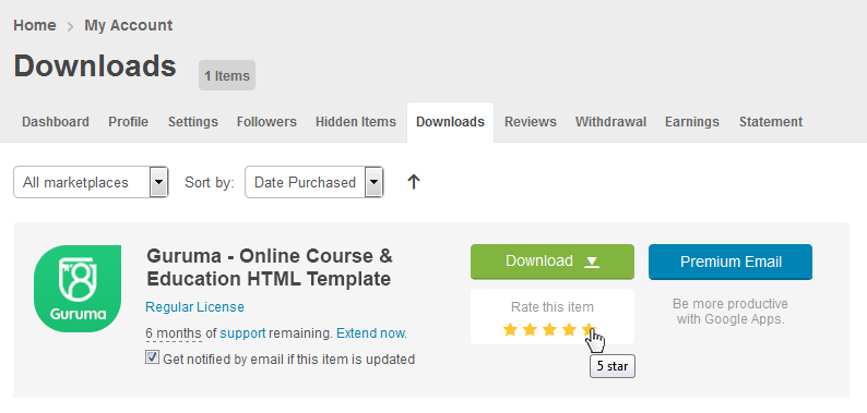
How to rate this item
If you like our theme and support, Please do not forget to rate it with 5 stars in your Downloads section and write a review in Comments as it will add more value to our services!
Kindly visit here: http://themeforest.net/downloads and find “Rate this item” below the download button and rate out the theme.
Advance Thanks in Anticipation!
Source & Credits
All images and videos are for preview purposes only and are not included in the download files. Images are of copyrights under Creative Commons CC0.
Images
- Shutterstock Shutterstock
- Pexels Pexels
- Unsplash Unsplash
JavaScripts
- Jquery
- Bootstrap
- Countdown
- Counter
- datetimepicker
- jarallax
- Magnific Popup
- snazzy maps
- nicescroll
- Owl Carousel 2
- popper
- range-slider
- Jquery appear
- Select2
- Slick
- Shuffle
- Swiper
CSS & Fonts
- Bootstrap
- Font Awesome
- Flaticon
- Google Fonts
- — Quicksand
- and more…